D.A. DAVIDSON
D.A. Davidson.com
Challenge
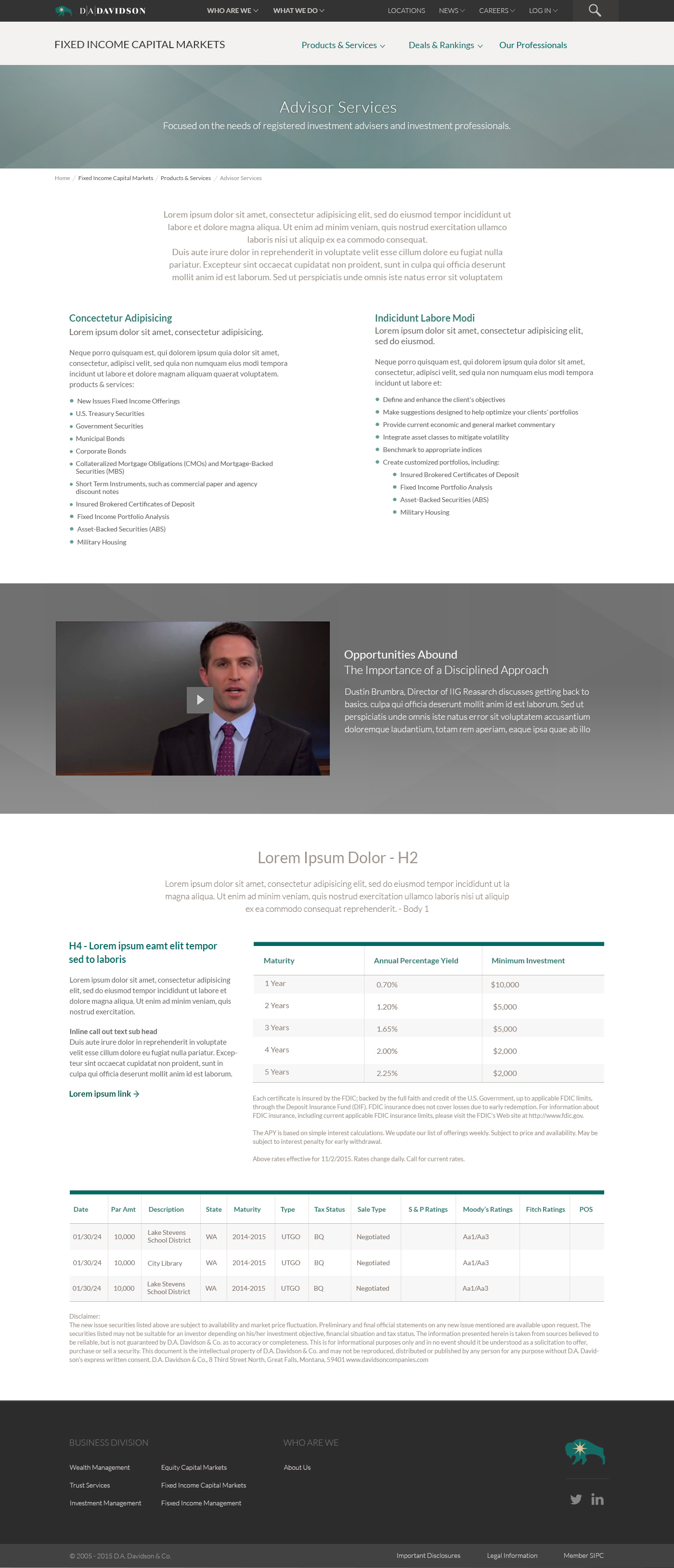
To consolidate 13 different microsite divisions of finance into one dynamic, corporate branded responsive site. All of this needed to be done on a finite budget, design only, and no copy, front-end work, or QA.
Considerations
Before starting the project, we had to gather all of the independent collateral that had been created over 15+ years and determine what unifying and consistent thread we could utilize to develop a clear brand statement.
Journey
We were given an initial palette to work with that might as well have been an old U.S. forest service map! Green, brown, slate, yellow, beige, and split pea soup. This didn’t leave us many combinations that felt aesthetically sophisticated or “financial”. We wanted to honor their brand history, but bring them to a more contemporary space so tinted all the colors and mixed them to create a modern look, but still relate to brand heritage. Using these tints in multiples gave us something really cool to work with. Nature, tonal builds and mountains–all in a site dedicated to investment and finance. This turned out to be very unique and set them apart from their competition.
Additional work (invision links)
Mobile - https://invis.io/FXSJS0V845H


